Brand kit
01Logo
The full logo is the mark plus the wordmark. Use it wherever there is room — it is the version people recognise.


02The mark on its own
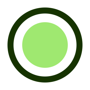
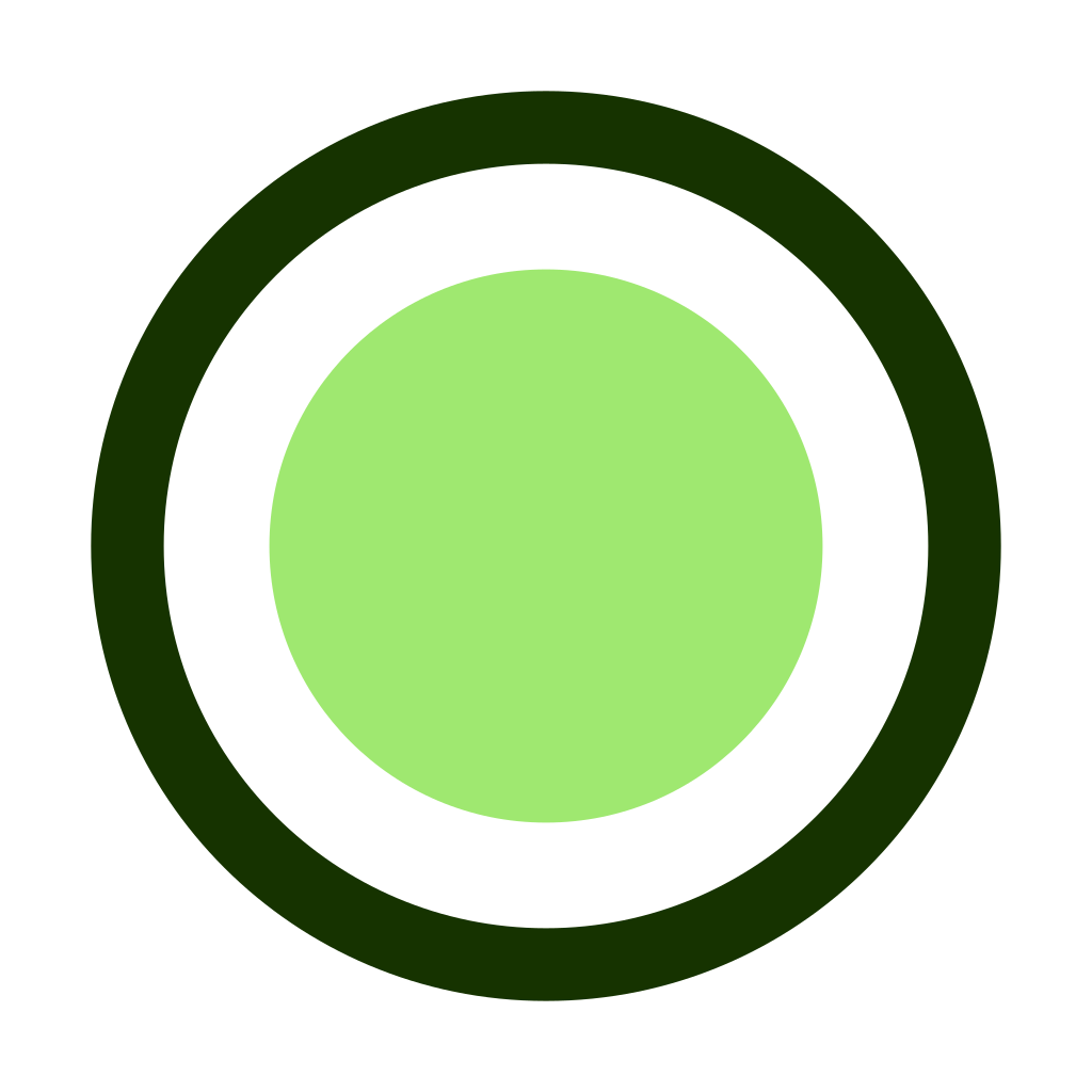
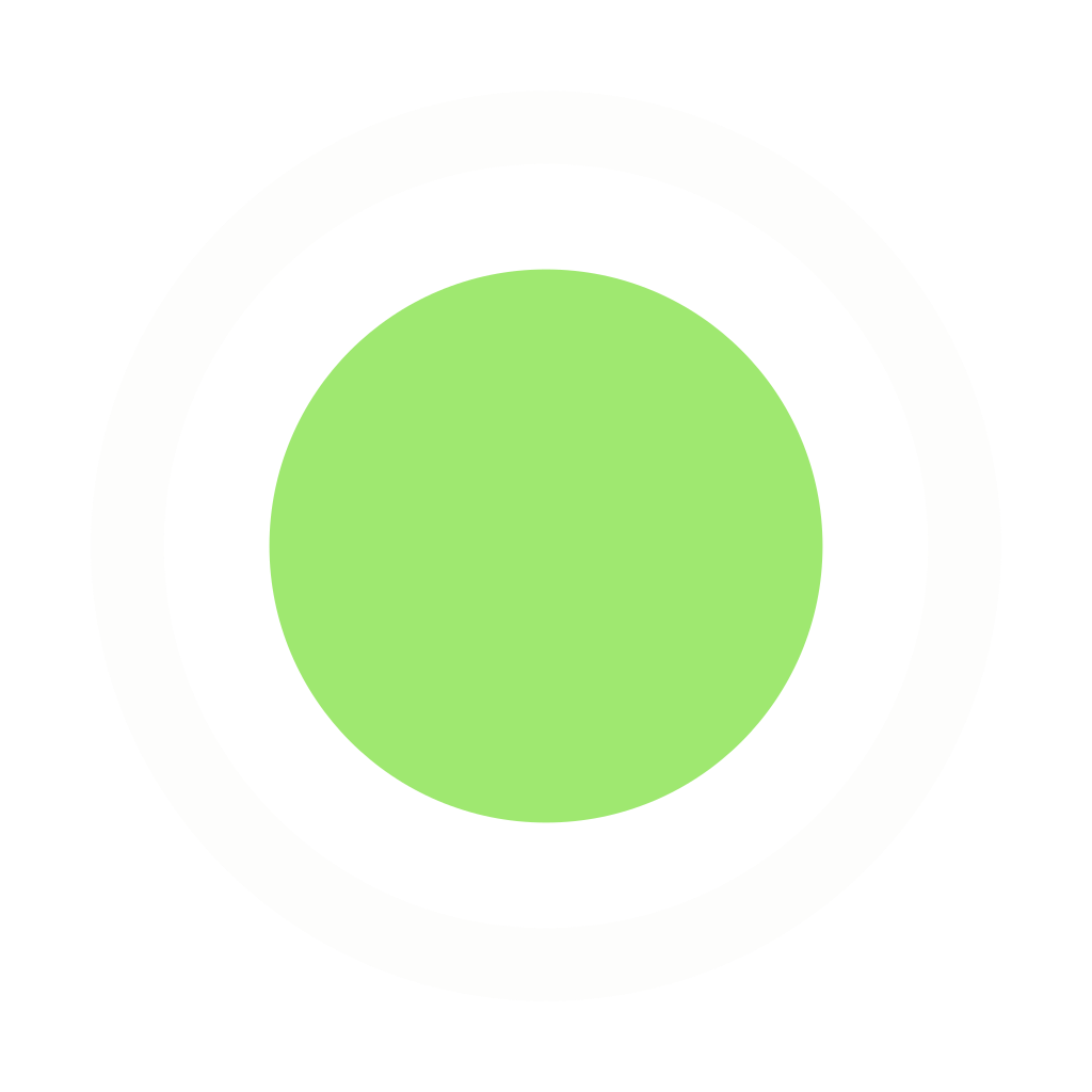
The ring and dot without the wordmark, for avatars, favicons, app tiles and anywhere too tight for the full logo. It ships with 10% clear space built in — that is the closest anything else should ever come to it.



03Colours
Halo green is a fill colour. As text on a light background it measures about 2:1, which fails WCAG AA, so anywhere it would carry words or a meaningful glyph we use the darker ink green instead.
04Using it well
Short version: don't redraw it.
- Keep clear space around the logo of at least the height of the dot.
- Don't recolour it. The two supplied versions cover light and dark; there is no third.
- Don't stretch, rotate, add effects, or put the logo on a busy photograph without a solid panel behind it.
- Don't rebuild the wordmark in another typeface, and don't set "Halo HSE" in place of the logo where the logo will fit.
- The names Halo, Halo Safety and Halo HSE, and these marks, belong to MB The Special Something. Use them to refer to us, not to imply we endorse or partnered on something.
Writing about the product? It is Halo HSE for the app and Halo Safety for the company and site. Neither is written in all caps.
Need something not here — a horizontal lockup, a specific colour space, a print-ready file? Email hello@halosafety.io and we will send it.